It made sense to me that this article by Susan Orlean was written in 2001, because that's about the time I remember Kinkade paintings being at the height of their popularity. You couldn't go into a Christian bookstore without seeing an entire section or wall dedicated to Kinkade, and I know we must have some form of one of his works in my house, somewhere. Even before I began studying art, I always thought the pieces were pretty, but they lacked something. And even then they seemed commercial. After reading this article, I was very put-off by the business and monopoly that Thomas Kinkade has created in the art world, but you have to admit, he was kind of brilliant.
He paints a certain number of works, which, granted, are quite beautiful. He decides he wants to share these works with the rest of the world, but it would be impossible to paint that many pictures. So why not create prints? Or even better, digital, high quality, on-canvas prints? And then have other painters come in to "highlight" the prints for the new buyers, so the buyers actually feel like they're getting something original.
The tone of the article was slightly mocking, and I agree. I laughed when I saw the author compare the "Limited Edition" prints to Beanie Babies. I also was irritated by the simpering, fawning people who work at the Signature Galleries across the country. It's a shame, because these paintings are truly pretty, but they are always going to be slightly stained with the fact that they are indeed copies, and they are produced in a rather soulless environment. People get what they pay for, and in this case, it's one of who knows how many lithographs (and they never really will tell, thus driving up demand), and a story to go behind it. All I kept thinking was "wow, this is pretty narcissistic of this guy." Making his employees know his birthday, his sad, broken childhood, his hopes and ambitions, just so they can pass on these kernels of sentimentality onto the next buyer? I thought it was a little shameful.
Or brilliant. According to the article he is "America's most profitable artist." I guess it's a matter of opinion.
Sunday, September 28, 2008
CEPA Review aka "I don't think they could have made this creepier if they tried."
This week, our assignment was the visit the CEPA Gallery downtown. Now, maybe it was because our subway car had a few issues getting there, or because the Market Arcade kind of looks like a scene from a Hitchcock film, but Jill and I were already apprehensive when we got to the gallery. First of all, the way the space is set up is completely disjointed - there is no flow at all between galleries, and while in this case none of them had similar subject matter, I can see this being a real problem if CEPA decided to show a single artist's work on all three floors.
The exhibit at CEPA right now is entitled "Trans-Evolution, Examining Bio Art." It sounded really cool to me at first, and I was curious to see how these three artists mingled science in their art. The first gallery we went into was Paul Vanouse's "Latent Figure Protocol," which shows manipulated DNA samples on looping video. I thought it was funny that they were able to make certain shapes with the seemingly glow-in-the-dark samples (such as the letters "ID" and the form of a skull and crossbones), but I think I would have appreciated and liked the exhibit much more if it had provided visitors with more comprehensive information about the experiment that was taking place (such as how it was done). While I don't claim to understand complex science, I would have liked to have been given the opportunity to really understand what was going on.
Okay, the basement. First of all, if Jill hadn't come with me, I seriously don't think I would have gone in. After going through a couple empty, dark spaces to find the entrance to the exhibit, you have to be "buzzed" in. The door shuts behind you with a distinct note of finality, and you find yourself in an even darker space, lit only by red fluorescent lights in two glass cases in front of you. One step further and you realize that the many things in the glass cases are taxidermied animals, including a rabbit, several frogs, and a snake. Creepy. Especially when you don't like snakes. Then, you see on the other half of the room, there is another experiment going on. There is a dark glass case which you can kind of make out a small science experiment, and something in one of the bulbs, but you have no idea what. Cue the video, which shows a woman scraping and cutting her own skin so she can manipulate the stem cells to grow new living tissue. In theory, fine. Then manipulating the new tissue into the shape of a coat? I mean, I understand that if you *can* do something, you might as well, but I felt like this was a little unprofessional, not to mention creepy. A closer look at that dark glass bulb showed the "skin coat" as it was dubbed by us, and once it started dripping, we were out of there.
The last exhibit on the third floor was done by Elizabeth Demary, and was entitled "Corpor Esurit, or we all deserve a break today." Basically, she had a very large ant farm, and fed the ants *only* McDonald's food for a month. I actually might have found this semi-interesting if it was in a science museum (and that actually goes for the other two shows as well), but I just couldn't really accept it in an "art" gallery. Over all, I was unimpressed by the exhibits and CEPA in general. I'd like to go back when there is an actual photography exhibit going on.
Sunday, September 21, 2008
Review of "Blow Up" by Lyle Ashton Harris
Lyle Ashton Harris is both a photographer and a multimedia artist. His exhibition, entitled "Blow Up" is at the UB North Art Gallery, located in the Center for the Arts. Once you enter the main building (distinguishable by a large glass triangle on top of the entrance), you will find that the gallery itself is located on your immediate left, behind a glass door with the gallery's hours in white letters (and the word "Thursday" spelled "Thrursday"...). There is a small information desk on your left, but directly in front of you is the first part of the exhibition.
While some of Harris' photography is traditional (mostly the work located on his website, not so much what was shown in "Blow Up"), this first collection of photos, entitled "Billie," really explains what Harris is all about. In the same vein as Cindy Sherman, Harris will disguise himself as different people (sometimes celebrities, sometimes not) and then take photographs of himself in various poses and stages. "Billie," combined with the next group of photos, entitled "American Triptych," shows some of the issues that Harris himself wants to confront; that is, sexuality, dressing in drag, racism, and the like. As you enter into the next gallery, this theme of searching for one's identity continues in several other pieces, and we see Harris dressed up and portrayed as many different people from all walks of life.
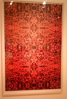
I'm unsure whether the small plaques beside many of the works were written by the gallery or by Harris' own camp, but they were very helpful in explaining the artist's thoughts behind specific works. Not all of Harris' photos are of himself - there is a collection on the first floor that is a cycle of photographs from an Italian football (soccer) game. Originally (and I know this thanks to one of the aforementioned plaques), Harris wanted to concentrate on the issue of racism in the sport, but after he arrived, he was swept up with the energy of the crowds of fans watching the match. He instead turned the focus of his work onto the frenetic crowd. My favorite piece from this cycle was untitled, but featured a monochromatic photo of an Italian crowd. What was interesting about the piece was that it was done in red, and Harris had "mirror-imaged" the photo several times so it was four times as big as it had originally been.
Several years ago the artist took a trip to Ghana, and many of his more recent pieces are a direct result from this visit. In the light-well of the gallery there are two photographs draped with Ghanian funerary textiles, and the motifs on these textiles are repeated in the gallery on the second floor. In the collection entitled "Accra My Love," one entire wall is a montage of different collectibles and photographs from Ghana, including a tourist map. Collections of oversized pillows litter the floor, and are covered in the same types of Ghanian funeral textiles. Instead of the video installation catching my eye, I was drawn to a large blanket that Harris covered in oil paintings. There were many different styles and motifs, but the one that I found most interesting was a small square where Harris replicated Manet's "Olympia." It was an intriguing addition to an already eclectic exhibition.
The Art Object and the Esthetics of Impermanence - Harold Rosenberg
When I first read the title to this article, I stopped to think about what it meant. Even before I went on to read about the artists mentioned in the work, I thought about many of the contemporary artists we are studying and how many of them create works solely for a specific exhibit or show, and how many (or all) of these works are simply destroyed after said show is completed. More specifically, I was thinking of the one mural our professor showed us that was painted on the wall at Hallwalls' last location, right before the gallery moved. It was a beautiful scene (more of a sophisticated cartoon), and so much work went into it for it to simply last a few weeks, before the wall was whitewashed and the space was used for something new.
This act of creating "impermanent" art is relatively new - it would have been unheard of prior to 1900. In antiquity through the Renaissance, artists were almost preoccupied with finding ways to make their work last longer. They developed the process of fresco, that is, painting on wet plaster, so the pigments would bond with the plaster chemically, and thus the painting would actually become part of the wall. During the Renaissance, Leonardo da Vinci tried to enhance this process and create an even longer lasting fresco, but unfortunately was unsuccessful. Even though the artist sought to make his fresco last forever, "The Last Supper" started to flake and peel less than a decade after it was created, and art restorers have spent millions of dollars and hours attempting to save this work of art.

How different then, from many artists today. In a world where artists are seeking any and every new way to express themselves, impermanent art has become more and more popular over the last fifty years. Duchamp referred to it as
Unfortunately, even this "rebellion" has started to become unoriginal and common place. What started as an "intellectual prop for changeless ideas" has become "a stylistic device" used by many different artists in as many different genres. Like their predecessors before them, today's artists will continue to have to find new and innovative ways to get their point across.

Perishable art by German sculptor Dieter Roth: Chocolate Lion (self portrait as a lion), chocolate, 1971.
This act of creating "impermanent" art is relatively new - it would have been unheard of prior to 1900. In antiquity through the Renaissance, artists were almost preoccupied with finding ways to make their work last longer. They developed the process of fresco, that is, painting on wet plaster, so the pigments would bond with the plaster chemically, and thus the painting would actually become part of the wall. During the Renaissance, Leonardo da Vinci tried to enhance this process and create an even longer lasting fresco, but unfortunately was unsuccessful. Even though the artist sought to make his fresco last forever, "The Last Supper" started to flake and peel less than a decade after it was created, and art restorers have spent millions of dollars and hours attempting to save this work of art.
How different then, from many artists today. In a world where artists are seeking any and every new way to express themselves, impermanent art has become more and more popular over the last fifty years. Duchamp referred to it as
"the most revolutionary attitude possible... because [the artists] know they're killing themselves. It is a form of suicide, as artists go; they kill themselves by using perishable materials."
Unfortunately, even this "rebellion" has started to become unoriginal and common place. What started as an "intellectual prop for changeless ideas" has become "a stylistic device" used by many different artists in as many different genres. Like their predecessors before them, today's artists will continue to have to find new and innovative ways to get their point across.
Sunday, September 14, 2008
A "Perfect Storm" - The Creation of Hallwalls
Until I did the reading for this week, I was under the impression that Hallwalls was a fairly recent creation. I knew about its recent history and the recent upheavals and moves, but I didn't fully realize how much more there was to its history. Hallwalls was a true bohemian innovation, created by a group of "kids" looking for a place to showcase their art, to grow as artists, and just to hang out in general.
The original creators of Hallwalls, Charles Clough and Robert Lango, were only 23 and 21 years old respectively when they decided to turn the walls that joined their art studios into a gallery. Their thirst for knowledge and their fun, laid-back personalities attracted other young artists in the Buffalo area. It's strange to think that someone like Cindy Sherman used to simply be categorized as a "Buff State Student." Slowly but surely, the young Hallwalls group managed to get their name out to the rest of the world, and even though they couldn't offer visiting artists many comforts, many of the artists were willing to come to Buffalo for free, as long as they had a place to party and sleep.
The combination of personalities in the first five years of Hallwalls set the stage for an organization that would still be going strong over thirty years later. Someone asked Ellen Carey "How come there are so many artists in New York from Buffalo?" She answered, "I said it was the finger of God that put us all there in Buffalo. Sometimes things happen, and this was a special, magical time." Without the perfect mix of characters, Hallwalls might not have survived through some of its early dry spells. The gallery needed accountants and writers and advertisers just as much as it needed its artists. Thankfully, the mix of the lifestyle of those already involved, the sense of promised camaraderie, and the common goal shared by the members of this group, were enough to attract everyone that Hallwalls needed to thrive.
My favorite quote from the article was from Biff Henrich. He said,
"People have asked me, 'Why did Hallwalls happen here, in Buffalo, and why at that particular time?' My only answer has been that it was a freak occurrence, a coincidence of the right personalities with an abundance of talent, ambition, enthusiasm, naivete, and persuasion skills arriving in on place about the same time."
Buffalo Arts Studio Review
The Buffalo Arts Studio is located on the fifth floor of the Tri-Main Building on Main Street. It's not exactly the setting you'd envision for a gallery at first - it seems like more of a warehouse than anything else. Stepping out of the elevator on the fifth floor, I wasn't exactly sure where to go, but I saw a sign for the Arts Studio that pointed me to the left. Walking through the factory-like hallways and passing different doorways leading to studios, galleries, and even what seemed to be a publishing company was a completely different experience than what I am used to. However, after several winding hallways, I finally found the actual "Buffalo Arts Studio."
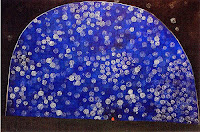 David Schirm, Dome of the Poet, 2008.
The Studio is tiny compared to some of the museums I've visited - it's only made up of two main galleries, and it showcases both local, national, and international contemporary artists. Right now, the two shows were those of Justin Thompson and David Schirm. When you first walk into the gallery space, you are greeted by a drooping sculpture of a tree. Thompson's installation is entitled Palms, and while I knew what it was a sculpture of, at first I couldn't figure out what it was made of.
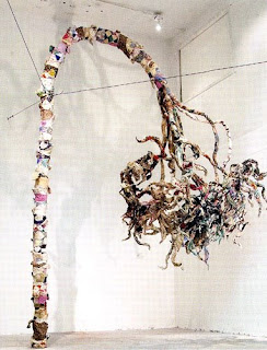 Justin Thompson, Palms Installation, 2008
With the help of some gallery hand-outs and closer examination, I saw that what Thompson had created was a soft sculpture around a metal base. The trees were made of recycled quilts! I thought it was a really great and unique idea. Walking into the main gallery, you see that Thompson has created a "forest" of sorts around the perimeter of the room. Some trees are completely upright, and some are drooping so low they touch the ground.. The quilted trees seemed to be an allegory for the past and for memory, and there was something both touching, beautiful, strong, and sad about them all at the same time.
When you walk into the next gallery, it becomes clear that these two artists have absolutely no connections nor anything in common. First of all, David Schirm's preferred medium is oil paint. Second, and more importantly, the majority of Schirm's works deal with blood, violence, and the end of the world. I was actually uncomfortable around some of his paintings that bear names like Celebration of the Bone Yard, Blood of the Waters, and End of Days.
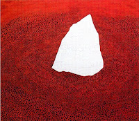 David Schirm, End of Days, 2008.
Many of his paintings show fountains, rivers, or oceans of blood. It was really unsettling. At the same time, there was one of his paintings that I loved, entitled Dome of the Poet. The painting shows a semicircle of blue against a dark background, and there are many light colored curlicues all over the painting. They are closer together and more prominent against the blue, and they seem like stars in a night sky. Over all, it really reminded me of Starry Night. There is a small red spot on the bottom of the painting, which reminded me of a star gazer, and someone looking out into an infinite void of stars. Unlike Schirm's other pieces, this one instilled a sense of hope in me.
Overall, I really liked the way the gallery was set up. You could walk in and out without ever seeing another person and you had plenty of privacy to view and appreciate the art in your own way.
 David Schirm, Dome of the Poet, 2008.
Sunday, September 7, 2008
Response to "The Creative Act" by Marcel Duchamp
If I'm going to be honest, I have to admit that I am not Marcel Duchamp's biggest fan. While I appreciate his innovation and desire to change what we consider art and how we view it, I still have never been particularly drawn to any of his own artistic works. That being said, I also have to admit that I was genuinely impressed by his article, "The Creative Act." There were many comments or remarks that stuck out to me, and I like the way he viewed the art surrounding him.
His main argument is that there are two factors in the creation of a work of art: the artist, who actually creates it, and the spectator, who decides if the piece is worthy of more attention and renown. I loved this quotation:
His main argument is that there are two factors in the creation of a work of art: the artist, who actually creates it, and the spectator, who decides if the piece is worthy of more attention and renown. I loved this quotation:
"Millions of artists create; only a few thousands are discussed or accepted by the spectator and many less are consecrated by posterity... the artist may shout from the rooftops that he is a genius: he will have to wait for the verdict of the spectator... [to see if] posterity includes him in the primers of Artist History."This is a true statement that has haunted me about art history for years. It seems like such a game of luck as to which artists actually become famous and which are lost to the shadows of history forever. Which artists can be guaranteed to be found in Art History 101 textbooks, and which are buried somewhere in the pages of an obscure book in an even obscurer library?
My favorite artistic time period is the Renaissance, and I can't help but wonder just how many geniuses went unnoticed due to lack of opportunity or appreciation. What about those artists who are too well-mannered to "shout from the rooftops" that they are geniuses? Van Gogh comes to mind as one who never forced his art on anyone, and died alone, miserable, and poor. Yet a few decades later, his work is in the highest demand. What changed? It seems like such a risky game to play with your life, allowing the "spectator" to literally decide your fate by proclaiming your work as "genius" or excoriating it as trash.
It is nearly impossible to perceive how a work of art will be perceived by viewers. Different patrons and different audiences may provide completely opposite reviews. The process of "esthetic osmosis" (my new favorite phrase) is unique to the individual spectator. Without the symbiotic (and possibly sometimes parasitic) relationship between the artist and his spectator, there would be no new art. For good or ill, that partnership is necessary for us to continue to designate masterpieces, and to see who will never achieve posterity and thus will be lost forever. Still, if we are to listen to Duchamp, at the end of the day "bad art is still art in the same way that a bad emotion is still an emotion."
Marcel Duchamp, "The Creative Act, " 1957.
Maria Lewis, "Art Minimal & Conception Only," 1999.
Review of the "Op Art Revisited" Exhibit at the Albright-Knox Art Gallery, Buffalo, New York
A friend and I decided to take advantage of the museum's free admission last Friday to go see the "Op Art Revisited" show at the Albright-Knox. Since it was a special exhibition, there was a nominal fee to enter, but we learned that museum members were able to see it for free. We had both been meaning to buy memberships for years, and we figured that, as seniors in college, this was a good a time as any! The exhibit itself was located on the upper level of the Gallery. Visitors must walk through the current "Natalie and Irving Forman Works on Paper" exhibit to get to the Op Art, and I thought the Minimalist works on paper were a nice foil to some of the later works we'd be seeing at Op Art.
I have always been a fan of Op Art and optical illusions in general. I would go out of my way to look for optical illusion books way before I started looking for books on Botticelli and Gentileschi! I still have a special place in my heart for Op Art, so I was excited to have a chance to see the exhibit, which absolutely did not disappoint. There was a vast range of styles, from Jean Pierre Yvaral's "Acceleration #15," which was made up of cords and painted wood, to Klaus Geissler's strange "Space Chamber," which made you feel like you were really looking into another world, to Bridget Riley's dreamy canvases that seem to swim before your eyes. The works seemed to either have been created predominately in the "age" of Op Art (the 1960s) or much more recently, such as from the year 2000 and on.
The entire exhibit was arranged in a series of five galleries, which were set up a little awkwardly to my taste. However, the lighting was excellent in all rooms but one, where there were several lighted artworks all in close proximity to each other - the lights reflected off the other pieces, and took away from the overall effect of the individual works. There was also a relatively equal balance between male and female artists - Bridget Riley even had a room dedicated to her.
I had two favorite pieces in the exhibit. The first was located in the first room, and was created by Josef Levi. His work, "Simurgh," from 1965, is the definition of an optical illusion. It's surreal to think that by simply placing two identical sheets of mesh grates several inches apart, you can create an illusion so entrancing that it can almost give the viewer a headache if he were to look at it for too long! I couldn't find a bigger picture than this, and unfortunately, you can't really get a feel for the illusion without seeing it in person.
My other favorite piece had an entire room dedicated to it. "Triple Ripple," by Olafur Eliasson, is an installation that uses three slowly spinning, vertical disks, that are suspended from the ceiling. On one side of each disk, there are concentric circles that are made from mirrors, and with the help of a single lamp in the corner, they catch the viewers' reflections as they revolve slowly. It was extremely creative and the piece created a mood that was both calm and curious. It was interesting to compare Levi's 1965 piece to Eliasson's, which was created in 2004. The desire to create Op Art is still alive, but each decade had very different interpretations of the same subject.
Subscribe to:
Comments (Atom)
