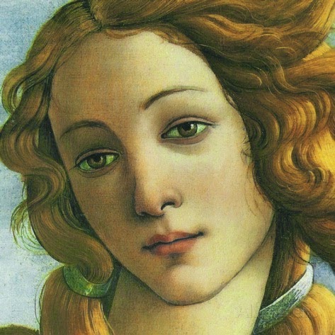
The "Albright-Knox deaccessioning" pretty much became buzz word during my sophomore year of college. I was actually taking a Renaissance art history course at the time, so the first I heard about it was in class. My professor, an avid Renaissance historian, was, of course, livid. We had just taken a field trip to the Art Gallery the week before to see some of their antique and Renaissance collection, and my professor had actually commented how strange it was that all the pieces were packed up, or recently cleaned. Anyway, it was that weekend that the Albright announced its plan to deaccession about 200 works of art from its permanent collection. People came out of the woodwork from all sides, both supporting and condemning the gallery's decision to sell off some of its permanent collection to purchase more modern and contemporary works of art, and to thus further the AKAG's "Statement of Purpose."
Now, I've worked with that livid professor, several other art historians at Canisius, as well as some staff over at the Albright itself. I've heard at least 15 different reasons for both keeping the works and for selling them. I've seen friends fight over the issue, and some professional relationships broken, and I've seen grown adults fight like children because of this issue. In the end, I don't think contesters had much of a chance to really stop the sale, and even though some may critique ArtVoice for "stirring the pot," the publication really introduced the sale to the population that doesn't read the BuffaloNews regularly. People got excited about art, which shows that people care. Buffalonian's are rabid (in a good way) about saving their city's history and legacy. And in the end, even though many people did disagree, the sale went through, and I don't think the AKAG lost a huge number of visitors or members because of it.
As for me, I love Renaissance art. And while I can appreciate Modern and Contemporary art, I dislike a lot more of it than I like. And that is my personal opinion. I understand the AKAG's decision to advance their already highly respected modern art collection, and I know for a fact that none (okay, well maybe one or two) of the people who work at the AKAG had any mobster intentions, or anything but the museum's future in mind. So, two years later, I'm glad the controversy happened, because it woke people up, and even if they might not be the most respected voices, I believe all Buffalonians had the right to have their say. Personally, I still wish I could see the Artemis, the Credi painting, and the della Robia ceramic. I'm disappointed, sure, but I don't blame the AKAG for their decision, nor do I visit the gallery less because of it. Am I moving to a city with a larger collection of Renaissance art in the future? Probably, and that's sad because I like Buffalo, but I feel like my interests can't be found within two hours of the city. Still, keeping those antiquities and other "masterworks" in storage weren't doing them any favors either...
Sunday, November 23, 2008
Sunday, November 16, 2008
Katherine Sehr at the Nina Freudenheim Gallery
I really had no idea what to expect when I left for the Nina Freudenheim Gallery on Friday. All I really knew about it was that it was yet another off-the-beaten track gallery that I had lived within five minutes of for four years, and had still never heard of. I was completely unaware that the Hotel Lenox on North Street even housed a contemporary gallery. Adding to this aura of mystery, there is very little information on the gallery's website. It is only text, no pictures, and the only real information available is the name of the current show and the gallery's hours.
I was pleasantly surprised when we walked into the space. The entire gallery is set in an apartment that has been cleared out. The space itself was beautiful - dark hardwood floors and accents, with white walls and a view overlooking Mayfair Lane. It was cozy and warm, and after walking into it, the gallery didn't seem out of place in the Lenox. As for Katherine Sehr's work, I enjoyed it very much. Sehr takes colored gel pens (like the ones that were so "in" 10 years ago, when many current college students were in middle school) and "doodles" across large (or small) canvases. I say "doodles" in quotations because her designs are intricately planned out. The works that use more than one color are particularly amazing, because Sehr has worked the doodles so that they mingle and create an almost-design, especially when viewed from further away.
There is almost no information about Sehr available online, which surprised me. If we hadn't run into one of the women who worked in the gallery, I really would have been clueless about the artist herself. As it was, she told us that Sehr likes to incorporate other artists' styles that have influenced her over the years. I recall one of the works being dedicated to Cezanne, while I thought another one looked a little like a Rothko. Overall, I really enjoyed the art as much as I enjoyed the art space.
Peter Schjeldahl's review of Gerhard Richter, March 2002
Peter Schjeldahl's actual art/artist critiques read very differently from his essays that we read earlier in the semester. Perhaps this is because the reviews were written for The New Yorker, whose audience encompasses a much wider audience than simply the art community. Schjeldahl's review of the German artist, Gerhard Richter, is sensitive, academic, and poignant all at once. Schjeldahl truly enjoys Richter's art, which he says represents "triumphant sorrow." The artist certainly has a sorrowful background, from growing up (and joining in) Nazi Germany, to the shame at the return of his father. These themes turn up throughout Richter's art, sometimes subtly, sometimes forcefully reminding the viewer of the artist's past.
I had never heard of Richter before, so after reading the article, I did a Google Images search and discovered that I really liked a lot of what he painted. Schjeldahl says he was never able to stay with one main style of painting, but rather jumped around to several, from abstraction to photo-realism. I was particularly intrigued by Richter's technique of painting an clear canvas in oil, and then using a squeegee to blur it and distort the image. He erases part of the painting's past, and leaves the viewer with a finished product that is both a new image, and a destroyed former one. The work spoken of most in Schjeldahl's piece is a painting called "Stag," which blends Richter's blurry oil painting of a stag with a stark, abstract, forest background. It draws the viewer in, due to the hints of depth, but also disables us from doing so, due to the prominent separation (in the form of a tree trunk) in the center of the painting. After doing a little research, I found that my favorite piece of Richter's work was his painting entitled, "Betty," which is a portrait of his daughter. Richter wanted to achieve a talent in painting to rival Vermeer, who is one of my favorite artists. "Betty" almost seems to be a photograph, and the slight sorrow in her pose is also reminiscent of the Dutch artist. Gerhard Richter was truly a Renaissance man of an artist, and Schjeldahl was able to capture this personality in his review.
Gerhard Richter, "Betty," 1988
I had never heard of Richter before, so after reading the article, I did a Google Images search and discovered that I really liked a lot of what he painted. Schjeldahl says he was never able to stay with one main style of painting, but rather jumped around to several, from abstraction to photo-realism. I was particularly intrigued by Richter's technique of painting an clear canvas in oil, and then using a squeegee to blur it and distort the image. He erases part of the painting's past, and leaves the viewer with a finished product that is both a new image, and a destroyed former one. The work spoken of most in Schjeldahl's piece is a painting called "Stag," which blends Richter's blurry oil painting of a stag with a stark, abstract, forest background. It draws the viewer in, due to the hints of depth, but also disables us from doing so, due to the prominent separation (in the form of a tree trunk) in the center of the painting. After doing a little research, I found that my favorite piece of Richter's work was his painting entitled, "Betty," which is a portrait of his daughter. Richter wanted to achieve a talent in painting to rival Vermeer, who is one of my favorite artists. "Betty" almost seems to be a photograph, and the slight sorrow in her pose is also reminiscent of the Dutch artist. Gerhard Richter was truly a Renaissance man of an artist, and Schjeldahl was able to capture this personality in his review.

Gerhard Richter, "Betty," 1988
Sunday, November 9, 2008
Second Hallwalls Visit, Jesse Webber and Kara Tanaka

I enjoyed my first Hallwalls visit very much, so I was looking forward to seeing the space's new shows by Jesse Webber and Kara Tanaka. Even the exhibition's names, "You can't smoke in here Mr. Corbusier, you'll burn this mother down" and Pining Wind respectively, caught my attention. Unfortunately, unlike the last two artists I saw there, Andrew Reyes and Rodney Taylor, neither of the current artists' works connected with me. Nothing currently located in the gallery particularly moved me, though I did appreciate the layout of the gallery space, and thought it worked with with the two shows by leading the visitor in a circle.
Jesse Webber's silk screens of the old grain silos just didn't do anything for me. I looked at the show's descriptions on the Hallwalls website before I visited, and even that didn't open up any of the works for me. And, with this show, if one of these works didn't move you, none of them would. I understood his desire to represent a world that had once been so promising, and had now fallen into such a state of disrepair, but I still didn't love any of the works. I did kind of like the large, rust sculpture that confronts you as soon as you enter the space, maybe because I felt more of the artist's presence in it. I also noticed that the neon orange "explosions" accompanying the photographs varied in intensity, but the pattern or reason behind it never made itself clear. Usually I like repetition and similar forms in artwork, but this time I was just unimpressed.
Following the gallery space around, I found myself in a smaller gallery space, with a strange object in the center of the room, and an even stranger one attached to the wall. I approached the central object first, and after a few tries, figured out how to watch the slideshow movie within this "satellite." Maybe I would have appreciated it more if I was familiar with the story behind it, but as it was, I thought it was too slow-paced and I got kind of bored pretty quickly. I liked Tanaka's general idea, thought the connection between the satellite and the images set in space was unique, but I just could not get into it.

Gadgetry - Does technology take away from museum experiences?
I do not believe technology is a bad thing. I actually think it's a very good thing. However, I am hesitant to say that the new advances in technology are conducive to museum visits. Marjorie Schwarzer's article on museum gadgetry walks the reader through the different types to technological media offered by museums across the country. These "gadgets" range from simple audioguides, which have been around since the fifties, and new, high-tech PDA systems that include color copies of the artwork, as well as audio commentary, and even videos that accompany the piece of work in question. After reading the article, I believe that there are two types of technology as applied to museums - ones that encourage active visitor participation, and ones that allow visitors to be passive.
Active visitor participation includes ideas like the Philadelphia Museum of Art had when they recreated the Japanese bowl and scroll. Visitors were allowed to interact with these "priceless" pieces and to get a real feel for them. Even though visitors knew the objects were not the originals, the technology needed to create the glass projection system and the exact replica of the bowl was still appreciated. A similar example is the art gallery that set up a computer kiosk where visitors could rearrange the art exhibit and leave their own commentary. These uses of technology encourage the visitor to get involved, and to develop a new (and personal) appreciation for the art. These technologies do not tell people what to think about what they are seeing, and allows them to express their own creativities.
I hate audio guides. Maybe they're an odd thing to hate, but I do indeed hate them. I think they're distracting and annoying, and that they actually take away from a visitor's experience. That is just my personal opinion, but I would much rather read a hand-out or a wall label than have to fiddle with buttons, watch as my battery dies, etcetera. Also, I'd like to think that people can be left to their own devices long enough to make up their own appreciation for whatever it is they're looking at, instead of being told what to think about it. The new computer and PDA systems will only make these problems worse, in addition to distracting people to the point where they never actually *look* at the art, they simply remain focused on their palm pilots.
Towards the end of the article, Schwarzer says, "We know that people visit museums to socialize with their companions. Do hand-helds cut off this experience or enhance it?" My answer is that they completely cut off any interaction with fellow visitors. People get lost in their own worlds when listening to audioguides, and even without the visual aids in the new PDAs, they tend to not really watch where they're going, nor if they cut in front of someone who was already looking at a work of art. Also, it's nearly impossible to have an enjoyable experience at a museum if you have opted to not get an audioguide, and your companion has. My mom and I have visited several galleries together, and she swears by audioguides, and insists on relaying everything she was told from them to me. While I do admit that some information was interesting, more often I end up arguing with a point, or making a different comparison out of sheer frustration.
Hand-helds that only encourage a visitor's passive interaction do not enhance their visits to museums. Visitors are told what to think instead of coming to their own conclusion, and usually walk right by other masterpieces that were not granted a spot on a particular audio tour. Give me a handout, wall text, and a map any day.
Sunday, November 2, 2008
Jozef Bajus, "The Combing Wave"
The Collector's Gallery at the Albright-Knox is the museum's version of a small art dealership. All the works in the Collector's Gallery are for sale, and some are even able to rent (though aside from impressing future parents-in-law, I don't see a huge point in "renting" a work of art for a price that is anywhere from 5%-10% of the work's price anyway). The gallery usually shows artists who are currently popular in NYC, or in the local WNY area. This time around, they are hosting a small exhibition of some recent works of Jozef Bajus, who is a professor over at Buff State. Bajus' main medium is paper, which he cuts and manipulates to create extremely interesting and intriguing works of art. Some of the works almost seemed like deconstructed origami.
For many of his works, Bajus creates his intended effect by layering sheets of paper. These sheets can be different colors, textures, etc, and usually they all have different forms cut out from the paper. It seemed as if Bajus' preferred "cut out" style was an oblong shape with pointed ends, almost like a surfboard. This shape repeated itself it many of the works shown at the Collector's Gallery. Once all of the desired layers are in place, you get a real sense of the beauty of the work that has been created. Two of my favorite pieces from the show actually formed a diptych, and were called "The Big Dipper" 1 and 2. They consisted of white sheets splattered with black paint, with more seemingly random cut outs. The overall effect almost looks like a layered Jackson Pollock. For these types of works, Bajus requires the observer to get up close and personal with the art - looking at these from a distance will not do any of the pieces justice.
My other favorite pieces in the show were a numbered sequence called "Summer Reading." For these, Bajus took entire books, and painstakingly folded each of the pages, sometimes in the same way, a few times in different ways. Sometimes he cut the pages, sometimes he left them whole. In the end, the books appeared to be mini origami sculptures. The technique reminded me of the way students in middle and high schools would fold the outdated pages of their school planners in various ways, and by the end of the year they would have a lot of (pretty) folded, multicolored paper. Bajus has taken that idea one step further and turned his books into real art.
As for the space itself, the Collector's Gallery is fairly cramped, but for this exhibit it forced you to view all of Bajus' works up close. There were a few tables that needed to be maneuvered around, and took a little away from the space, but all in all it was a quiet and cozy place to view some art which is actually available for purchase.

This work, entitled "Summer," gives you an idea of the depth and layers located in Bajus' work.
For many of his works, Bajus creates his intended effect by layering sheets of paper. These sheets can be different colors, textures, etc, and usually they all have different forms cut out from the paper. It seemed as if Bajus' preferred "cut out" style was an oblong shape with pointed ends, almost like a surfboard. This shape repeated itself it many of the works shown at the Collector's Gallery. Once all of the desired layers are in place, you get a real sense of the beauty of the work that has been created. Two of my favorite pieces from the show actually formed a diptych, and were called "The Big Dipper" 1 and 2. They consisted of white sheets splattered with black paint, with more seemingly random cut outs. The overall effect almost looks like a layered Jackson Pollock. For these types of works, Bajus requires the observer to get up close and personal with the art - looking at these from a distance will not do any of the pieces justice.
My other favorite pieces in the show were a numbered sequence called "Summer Reading." For these, Bajus took entire books, and painstakingly folded each of the pages, sometimes in the same way, a few times in different ways. Sometimes he cut the pages, sometimes he left them whole. In the end, the books appeared to be mini origami sculptures. The technique reminded me of the way students in middle and high schools would fold the outdated pages of their school planners in various ways, and by the end of the year they would have a lot of (pretty) folded, multicolored paper. Bajus has taken that idea one step further and turned his books into real art.
As for the space itself, the Collector's Gallery is fairly cramped, but for this exhibit it forced you to view all of Bajus' works up close. There were a few tables that needed to be maneuvered around, and took a little away from the space, but all in all it was a quiet and cozy place to view some art which is actually available for purchase.
This work, entitled "Summer," gives you an idea of the depth and layers located in Bajus' work.
Dave Hickey on "Dealing"
To put it simply: Art and money are cultural fictions with no intrinsic value.
That quote really stood out to me as I was reading Dave Hickey's chapter on art dealing, from his book Air Guitar. When it comes to art, a work is only worth as much as people are willing to pay for it, thus making the demand the commodity, instead of the artwork. How many times have we seen prices skyrocket because of a fad? Take Beanie Babies - they're basically stuffed animals, but for a brief period of time, some of those stuffed animals were selling for thousands and thousands of dollars due to limited supply. A few years later, people barely know what they are, let alone if they're worth anything. This same rule is applied to art - you have the opportunity to buy a piece when the artist is completely unknown, for possibly what can still be considered a high price, but a price that is probably less than half of what you'd pay if this said artist becomes famous. However, like Dave Hickey said, this can easily be a "bad bet" that will never pay off.
With the recent financial meltdowns and crises, it's becoming more and more apparent that our currency is only paper. What a dollar bought yesterday isn't what a dollar buys today. The paper itself has no intrinsic value, only a calculated value that is mutable at best. I liked that Hickey separated art and money - it makes it seem as if everything is more of a trade or a gamble than a sale. Both "trade" and "gamble" are more abstract ideas than "sale," and it makes sense that this idea would appeal to an art crowd (or at least an art crowd that professes a disinterest in All-American capitalism). Overall, I really enjoyed this chapter from Hickey's book. I appreciate his guts in leaving his literary graduate career (which he seems to have returned to, after all) and starting a small gallery. He never seemed to get cocky about his little space, and insisted that he was only making a living, not "making money." WIth the uncertain futures of previously stable careers staring us all in the face, this is probably a great philosophy to adhere to.
Subscribe to:
Posts (Atom)