The "Albright-Knox deaccessioning" pretty much became buzz word during my sophomore year of college. I was actually taking a Renaissance art history course at the time, so the first I heard about it was in class. My professor, an avid Renaissance historian, was, of course, livid. We had just taken a field trip to the Art Gallery the week before to see some of their antique and Renaissance collection, and my professor had actually commented how strange it was that all the pieces were packed up, or recently cleaned. Anyway, it was that weekend that the Albright announced its plan to deaccession about 200 works of art from its permanent collection. People came out of the woodwork from all sides, both supporting and condemning the gallery's decision to sell off some of its permanent collection to purchase more modern and contemporary works of art, and to thus further the AKAG's "Statement of Purpose."
Now, I've worked with that livid professor, several other art historians at Canisius, as well as some staff over at the Albright itself. I've heard at least 15 different reasons for both keeping the works and for selling them. I've seen friends fight over the issue, and some professional relationships broken, and I've seen grown adults fight like children because of this issue. In the end, I don't think contesters had much of a chance to really stop the sale, and even though some may critique ArtVoice for "stirring the pot," the publication really introduced the sale to the population that doesn't read the BuffaloNews regularly. People got excited about art, which shows that people care. Buffalonian's are rabid (in a good way) about saving their city's history and legacy. And in the end, even though many people did disagree, the sale went through, and I don't think the AKAG lost a huge number of visitors or members because of it.
As for me, I love Renaissance art. And while I can appreciate Modern and Contemporary art, I dislike a lot more of it than I like. And that is my personal opinion. I understand the AKAG's decision to advance their already highly respected modern art collection, and I know for a fact that none (okay, well maybe one or two) of the people who work at the AKAG had any mobster intentions, or anything but the museum's future in mind. So, two years later, I'm glad the controversy happened, because it woke people up, and even if they might not be the most respected voices, I believe all Buffalonians had the right to have their say. Personally, I still wish I could see the Artemis, the Credi painting, and the della Robia ceramic. I'm disappointed, sure, but I don't blame the AKAG for their decision, nor do I visit the gallery less because of it. Am I moving to a city with a larger collection of Renaissance art in the future? Probably, and that's sad because I like Buffalo, but I feel like my interests can't be found within two hours of the city. Still, keeping those antiquities and other "masterworks" in storage weren't doing them any favors either...
Sunday, November 23, 2008
Sunday, November 16, 2008
Katherine Sehr at the Nina Freudenheim Gallery
I really had no idea what to expect when I left for the Nina Freudenheim Gallery on Friday. All I really knew about it was that it was yet another off-the-beaten track gallery that I had lived within five minutes of for four years, and had still never heard of. I was completely unaware that the Hotel Lenox on North Street even housed a contemporary gallery. Adding to this aura of mystery, there is very little information on the gallery's website. It is only text, no pictures, and the only real information available is the name of the current show and the gallery's hours.
I was pleasantly surprised when we walked into the space. The entire gallery is set in an apartment that has been cleared out. The space itself was beautiful - dark hardwood floors and accents, with white walls and a view overlooking Mayfair Lane. It was cozy and warm, and after walking into it, the gallery didn't seem out of place in the Lenox. As for Katherine Sehr's work, I enjoyed it very much. Sehr takes colored gel pens (like the ones that were so "in" 10 years ago, when many current college students were in middle school) and "doodles" across large (or small) canvases. I say "doodles" in quotations because her designs are intricately planned out. The works that use more than one color are particularly amazing, because Sehr has worked the doodles so that they mingle and create an almost-design, especially when viewed from further away.
There is almost no information about Sehr available online, which surprised me. If we hadn't run into one of the women who worked in the gallery, I really would have been clueless about the artist herself. As it was, she told us that Sehr likes to incorporate other artists' styles that have influenced her over the years. I recall one of the works being dedicated to Cezanne, while I thought another one looked a little like a Rothko. Overall, I really enjoyed the art as much as I enjoyed the art space.
Peter Schjeldahl's review of Gerhard Richter, March 2002
Peter Schjeldahl's actual art/artist critiques read very differently from his essays that we read earlier in the semester. Perhaps this is because the reviews were written for The New Yorker, whose audience encompasses a much wider audience than simply the art community. Schjeldahl's review of the German artist, Gerhard Richter, is sensitive, academic, and poignant all at once. Schjeldahl truly enjoys Richter's art, which he says represents "triumphant sorrow." The artist certainly has a sorrowful background, from growing up (and joining in) Nazi Germany, to the shame at the return of his father. These themes turn up throughout Richter's art, sometimes subtly, sometimes forcefully reminding the viewer of the artist's past.
I had never heard of Richter before, so after reading the article, I did a Google Images search and discovered that I really liked a lot of what he painted. Schjeldahl says he was never able to stay with one main style of painting, but rather jumped around to several, from abstraction to photo-realism. I was particularly intrigued by Richter's technique of painting an clear canvas in oil, and then using a squeegee to blur it and distort the image. He erases part of the painting's past, and leaves the viewer with a finished product that is both a new image, and a destroyed former one. The work spoken of most in Schjeldahl's piece is a painting called "Stag," which blends Richter's blurry oil painting of a stag with a stark, abstract, forest background. It draws the viewer in, due to the hints of depth, but also disables us from doing so, due to the prominent separation (in the form of a tree trunk) in the center of the painting. After doing a little research, I found that my favorite piece of Richter's work was his painting entitled, "Betty," which is a portrait of his daughter. Richter wanted to achieve a talent in painting to rival Vermeer, who is one of my favorite artists. "Betty" almost seems to be a photograph, and the slight sorrow in her pose is also reminiscent of the Dutch artist. Gerhard Richter was truly a Renaissance man of an artist, and Schjeldahl was able to capture this personality in his review.
Gerhard Richter, "Betty," 1988
I had never heard of Richter before, so after reading the article, I did a Google Images search and discovered that I really liked a lot of what he painted. Schjeldahl says he was never able to stay with one main style of painting, but rather jumped around to several, from abstraction to photo-realism. I was particularly intrigued by Richter's technique of painting an clear canvas in oil, and then using a squeegee to blur it and distort the image. He erases part of the painting's past, and leaves the viewer with a finished product that is both a new image, and a destroyed former one. The work spoken of most in Schjeldahl's piece is a painting called "Stag," which blends Richter's blurry oil painting of a stag with a stark, abstract, forest background. It draws the viewer in, due to the hints of depth, but also disables us from doing so, due to the prominent separation (in the form of a tree trunk) in the center of the painting. After doing a little research, I found that my favorite piece of Richter's work was his painting entitled, "Betty," which is a portrait of his daughter. Richter wanted to achieve a talent in painting to rival Vermeer, who is one of my favorite artists. "Betty" almost seems to be a photograph, and the slight sorrow in her pose is also reminiscent of the Dutch artist. Gerhard Richter was truly a Renaissance man of an artist, and Schjeldahl was able to capture this personality in his review.

Gerhard Richter, "Betty," 1988
Sunday, November 9, 2008
Second Hallwalls Visit, Jesse Webber and Kara Tanaka

I enjoyed my first Hallwalls visit very much, so I was looking forward to seeing the space's new shows by Jesse Webber and Kara Tanaka. Even the exhibition's names, "You can't smoke in here Mr. Corbusier, you'll burn this mother down" and Pining Wind respectively, caught my attention. Unfortunately, unlike the last two artists I saw there, Andrew Reyes and Rodney Taylor, neither of the current artists' works connected with me. Nothing currently located in the gallery particularly moved me, though I did appreciate the layout of the gallery space, and thought it worked with with the two shows by leading the visitor in a circle.
Jesse Webber's silk screens of the old grain silos just didn't do anything for me. I looked at the show's descriptions on the Hallwalls website before I visited, and even that didn't open up any of the works for me. And, with this show, if one of these works didn't move you, none of them would. I understood his desire to represent a world that had once been so promising, and had now fallen into such a state of disrepair, but I still didn't love any of the works. I did kind of like the large, rust sculpture that confronts you as soon as you enter the space, maybe because I felt more of the artist's presence in it. I also noticed that the neon orange "explosions" accompanying the photographs varied in intensity, but the pattern or reason behind it never made itself clear. Usually I like repetition and similar forms in artwork, but this time I was just unimpressed.
Following the gallery space around, I found myself in a smaller gallery space, with a strange object in the center of the room, and an even stranger one attached to the wall. I approached the central object first, and after a few tries, figured out how to watch the slideshow movie within this "satellite." Maybe I would have appreciated it more if I was familiar with the story behind it, but as it was, I thought it was too slow-paced and I got kind of bored pretty quickly. I liked Tanaka's general idea, thought the connection between the satellite and the images set in space was unique, but I just could not get into it.

Gadgetry - Does technology take away from museum experiences?
I do not believe technology is a bad thing. I actually think it's a very good thing. However, I am hesitant to say that the new advances in technology are conducive to museum visits. Marjorie Schwarzer's article on museum gadgetry walks the reader through the different types to technological media offered by museums across the country. These "gadgets" range from simple audioguides, which have been around since the fifties, and new, high-tech PDA systems that include color copies of the artwork, as well as audio commentary, and even videos that accompany the piece of work in question. After reading the article, I believe that there are two types of technology as applied to museums - ones that encourage active visitor participation, and ones that allow visitors to be passive.
Active visitor participation includes ideas like the Philadelphia Museum of Art had when they recreated the Japanese bowl and scroll. Visitors were allowed to interact with these "priceless" pieces and to get a real feel for them. Even though visitors knew the objects were not the originals, the technology needed to create the glass projection system and the exact replica of the bowl was still appreciated. A similar example is the art gallery that set up a computer kiosk where visitors could rearrange the art exhibit and leave their own commentary. These uses of technology encourage the visitor to get involved, and to develop a new (and personal) appreciation for the art. These technologies do not tell people what to think about what they are seeing, and allows them to express their own creativities.
I hate audio guides. Maybe they're an odd thing to hate, but I do indeed hate them. I think they're distracting and annoying, and that they actually take away from a visitor's experience. That is just my personal opinion, but I would much rather read a hand-out or a wall label than have to fiddle with buttons, watch as my battery dies, etcetera. Also, I'd like to think that people can be left to their own devices long enough to make up their own appreciation for whatever it is they're looking at, instead of being told what to think about it. The new computer and PDA systems will only make these problems worse, in addition to distracting people to the point where they never actually *look* at the art, they simply remain focused on their palm pilots.
Towards the end of the article, Schwarzer says, "We know that people visit museums to socialize with their companions. Do hand-helds cut off this experience or enhance it?" My answer is that they completely cut off any interaction with fellow visitors. People get lost in their own worlds when listening to audioguides, and even without the visual aids in the new PDAs, they tend to not really watch where they're going, nor if they cut in front of someone who was already looking at a work of art. Also, it's nearly impossible to have an enjoyable experience at a museum if you have opted to not get an audioguide, and your companion has. My mom and I have visited several galleries together, and she swears by audioguides, and insists on relaying everything she was told from them to me. While I do admit that some information was interesting, more often I end up arguing with a point, or making a different comparison out of sheer frustration.
Hand-helds that only encourage a visitor's passive interaction do not enhance their visits to museums. Visitors are told what to think instead of coming to their own conclusion, and usually walk right by other masterpieces that were not granted a spot on a particular audio tour. Give me a handout, wall text, and a map any day.
Sunday, November 2, 2008
Jozef Bajus, "The Combing Wave"
The Collector's Gallery at the Albright-Knox is the museum's version of a small art dealership. All the works in the Collector's Gallery are for sale, and some are even able to rent (though aside from impressing future parents-in-law, I don't see a huge point in "renting" a work of art for a price that is anywhere from 5%-10% of the work's price anyway). The gallery usually shows artists who are currently popular in NYC, or in the local WNY area. This time around, they are hosting a small exhibition of some recent works of Jozef Bajus, who is a professor over at Buff State. Bajus' main medium is paper, which he cuts and manipulates to create extremely interesting and intriguing works of art. Some of the works almost seemed like deconstructed origami.
For many of his works, Bajus creates his intended effect by layering sheets of paper. These sheets can be different colors, textures, etc, and usually they all have different forms cut out from the paper. It seemed as if Bajus' preferred "cut out" style was an oblong shape with pointed ends, almost like a surfboard. This shape repeated itself it many of the works shown at the Collector's Gallery. Once all of the desired layers are in place, you get a real sense of the beauty of the work that has been created. Two of my favorite pieces from the show actually formed a diptych, and were called "The Big Dipper" 1 and 2. They consisted of white sheets splattered with black paint, with more seemingly random cut outs. The overall effect almost looks like a layered Jackson Pollock. For these types of works, Bajus requires the observer to get up close and personal with the art - looking at these from a distance will not do any of the pieces justice.
My other favorite pieces in the show were a numbered sequence called "Summer Reading." For these, Bajus took entire books, and painstakingly folded each of the pages, sometimes in the same way, a few times in different ways. Sometimes he cut the pages, sometimes he left them whole. In the end, the books appeared to be mini origami sculptures. The technique reminded me of the way students in middle and high schools would fold the outdated pages of their school planners in various ways, and by the end of the year they would have a lot of (pretty) folded, multicolored paper. Bajus has taken that idea one step further and turned his books into real art.
As for the space itself, the Collector's Gallery is fairly cramped, but for this exhibit it forced you to view all of Bajus' works up close. There were a few tables that needed to be maneuvered around, and took a little away from the space, but all in all it was a quiet and cozy place to view some art which is actually available for purchase.

This work, entitled "Summer," gives you an idea of the depth and layers located in Bajus' work.
For many of his works, Bajus creates his intended effect by layering sheets of paper. These sheets can be different colors, textures, etc, and usually they all have different forms cut out from the paper. It seemed as if Bajus' preferred "cut out" style was an oblong shape with pointed ends, almost like a surfboard. This shape repeated itself it many of the works shown at the Collector's Gallery. Once all of the desired layers are in place, you get a real sense of the beauty of the work that has been created. Two of my favorite pieces from the show actually formed a diptych, and were called "The Big Dipper" 1 and 2. They consisted of white sheets splattered with black paint, with more seemingly random cut outs. The overall effect almost looks like a layered Jackson Pollock. For these types of works, Bajus requires the observer to get up close and personal with the art - looking at these from a distance will not do any of the pieces justice.
My other favorite pieces in the show were a numbered sequence called "Summer Reading." For these, Bajus took entire books, and painstakingly folded each of the pages, sometimes in the same way, a few times in different ways. Sometimes he cut the pages, sometimes he left them whole. In the end, the books appeared to be mini origami sculptures. The technique reminded me of the way students in middle and high schools would fold the outdated pages of their school planners in various ways, and by the end of the year they would have a lot of (pretty) folded, multicolored paper. Bajus has taken that idea one step further and turned his books into real art.
As for the space itself, the Collector's Gallery is fairly cramped, but for this exhibit it forced you to view all of Bajus' works up close. There were a few tables that needed to be maneuvered around, and took a little away from the space, but all in all it was a quiet and cozy place to view some art which is actually available for purchase.
This work, entitled "Summer," gives you an idea of the depth and layers located in Bajus' work.
Dave Hickey on "Dealing"
To put it simply: Art and money are cultural fictions with no intrinsic value.
That quote really stood out to me as I was reading Dave Hickey's chapter on art dealing, from his book Air Guitar. When it comes to art, a work is only worth as much as people are willing to pay for it, thus making the demand the commodity, instead of the artwork. How many times have we seen prices skyrocket because of a fad? Take Beanie Babies - they're basically stuffed animals, but for a brief period of time, some of those stuffed animals were selling for thousands and thousands of dollars due to limited supply. A few years later, people barely know what they are, let alone if they're worth anything. This same rule is applied to art - you have the opportunity to buy a piece when the artist is completely unknown, for possibly what can still be considered a high price, but a price that is probably less than half of what you'd pay if this said artist becomes famous. However, like Dave Hickey said, this can easily be a "bad bet" that will never pay off.
With the recent financial meltdowns and crises, it's becoming more and more apparent that our currency is only paper. What a dollar bought yesterday isn't what a dollar buys today. The paper itself has no intrinsic value, only a calculated value that is mutable at best. I liked that Hickey separated art and money - it makes it seem as if everything is more of a trade or a gamble than a sale. Both "trade" and "gamble" are more abstract ideas than "sale," and it makes sense that this idea would appeal to an art crowd (or at least an art crowd that professes a disinterest in All-American capitalism). Overall, I really enjoyed this chapter from Hickey's book. I appreciate his guts in leaving his literary graduate career (which he seems to have returned to, after all) and starting a small gallery. He never seemed to get cocky about his little space, and insisted that he was only making a living, not "making money." WIth the uncertain futures of previously stable careers staring us all in the face, this is probably a great philosophy to adhere to.
Sunday, October 19, 2008
Big Orbit Gallery: "Red Hearts/Black Tongues" by David Mitchell
When we first pulled up to the entrance of the Big Orbit Gallery, I wasn't even really sure where to go. We managed to find the entrance which is located at the top of some very dilapidated-looking wooden steps, across from a larger-than-life plaster cast of a woman's body. The door was blacked out except for the name of the gallery and exhibit, and at first we opened the door to nearly complete darkness. There was music playing, but nearly no light. You could see the silhouettes of two cars, and upon walking further, that there were actually screens in the cars. The screens depicted a man and a woman, in each of the two cars, and they had tears digitally streaming down their faces. It was poignant and puzzling at the same time.
I had looked up the description of the exhibition before I came, so I knew David Mitchell's proposed project was to depict crashed cars and taxidermy deer. In the darkness, I couldn't see any deer, and it was a little eerie in the space - I was just hoping that they didn't fall out of the sky at the end of the 10 minute installation loop. It turns out that we had entered in nearly two minutes into the loop, so we were out of sync with the story. Watching from the beginning, you begin to comprehend a little more, and thus when the headlights on the cars go bright and the inner car screens go dark, you know what happened. The video at the back of the space was completely eerie, but at the same time, it wasn't scary. Seeing the two human figures prone inside the darkening heart was a little unsettling, but at the same time, it was also peaceful. I liked the way the actual installation heart (a raised platform on the floor) had lights that slowly got brighter, instead of blinding you all at once.
I thought that the deer and the humans were an interesting comparison - in the end, we're all just road kill, but what matters is finding someone you love. I didn't even mind the taxidermy deer as much as I thought I would. But I did think that I liked Mitchell's sketch for the space (shown below) better than the actual installation. If you're going to use deer as a symbol for roadkill, and you want to show the tenderness between them, do something like you did in the sketch. I thought standing them up, having their obviously plasticized tongues touching simply could have been done better. In the sketch, the deer are lying down and the moment is more tender. I felt like the postures of the humans in the video and the taxidermy deer in the actual instillation didn't add up.
Still, I liked it. You just need to watch it from the beginning to comprehend what the artist wanted to convey.
The JFK Assassination and Ant Farm's "Eternal Frame"
Even though my major is in Art History, I usually concern myself with the pre-1900 world. That being said, I have never taken an American history class besides the one I took my junior year of high school, and even then we didn't get past 1980. We only brushed on the JFK assassination, since my teacher decided to focus more on the cultural impact than anything else. I had heard of "the grassy knoll" but never really knew what it referred to, and I knew there were some conspiracy theories about Lee Harvey Oswald, but I couldn't name any. The entire decade that was the 1960s was such an upheaval in history - so many significant assassinations, and so much unrest in the country. I can only wonder if the world would be different today if JFK, Martin Luther King Jr., and Bobby Kennedy, as well as others, hadn't been assassinated within five years of each other.
I finally had the chance to look up some of the history of the JFK assassination in Dallas, and I have to agree that some things simply don't add up. While I've never been big on conspiracy theories, I feel like the entire case/autopsy/later rulings were mishandled and are thus relatively open to interpretation. There were over 15 completely separate conspiracy theories on ONE website I looked at, and I'm sure there are many more. I found that I was intrigued by them, and had to give several of them credit. You always have to wonder if the Vice President really only accepts the ticket in the hopes that maybe one day they'll be the one in the Oval Office.
Americans have always been obsessed with media, to the point where one could argue that we are completely controlled by it. I think Ant Farm's "Eternal Frame" is a good example of how people use media to relive the past. These artists wanted to be a part of this chunk of history, and they brought all of the passersby in the area along with them. People were so touched that they didn't even seem to mind that two of the women in the procession were portrayed by men in drag!
I feel like I don't know enough about the event itself to make too much of a comment on it, and because of this I'm kind of unenthusiastically looking forward to seeing either the Zapruder film or the "Eternal Frame" in class. Looking forward to it because it's a part of history that irrevocably changed our country; unenthusiastically because I am not one for enjoying a particularly violent movie. Several of the writers in our readings remarked that they were haunted by the videos, especially the "Eternal Frame" which replays the same scene over and over again, until the viewer supposedly becomes numb and accepts it, and tries to get something more out of the imagery. I feel that if I watch something violent over and over again, the picture will just be even more rooted in my subconscious than it would be otherwise - think of something you've only seen once, and probably only at a glance, and how something that brief can stick with you (and maybe haunt you) for the rest of your life.
Sunday, October 5, 2008
Review of Hallwalls: Rodney Taylor and Andrew Reyes Shows
I was so glad to finally have a chance to visit Hallwalls. I had been hearing about the space for a year, but for some reason I never managed to get downtown to see it. I was curious to see how the church had been renovated to the point that it could house a contemporary art gallery, and I was not disappointed. The new architecture is immediately apparent when you pull in the driveway and see the large glass-enclosed staircase dominating the back of the church.
Walking into the first floor, you are greeted with a space that reminded me most of the Buffalo Arts Studio - one room, set up with movable walls, and holding two completely different shows in each room. What was different about this space, though, was that it seemed that the walls were intentionally set up haphazardly, so you could glance the other exhibition through gaps in the walls. We went into Rodney Taylor's gallery first, and even though his images are rather dismal, (think blood-red tree growing out of the Capitol Building that is drowning in a sea of turbulent waters) I still really liked them. Even though the trees were dead or dying, falling apart, or being burned, I still thought they held a significant amount of power. Then, you get closer and realize that there are pencil sketches on several of the drawings. They add detail, and once again, they aren't particularly reassuring, but they add to the overall auras of the works.
I particularly loved how the works were executed, by layering paint so much that it chipped away and looked like real, peeling tree bark. It also continued to convey the sense of destruction and decay at work in his paintings. These are works on paper, and are attached to the wall only via push pin, which left some of the paper puckering out from the wall. It was a nice reminder that his trees were actually created on a material that would not exist without them.
Andrew Reyes' work was mostly photography, with two mixed media pieces thrown in. The handout from the gallery says that Reyes tries to heighten the mundane, but I didn't think that his photos were mundane at all. They all paid such careful attention to detail and to composition. The photograph of a man with the cauliflower eye was humorous, while the photo of the colorful flower doused in rain was beautiful. Reyes also includes text in some of his works, such as a picture of two birds sitting in a tree, with the caption, "do me a favor dave, shoot me if i'm still working this branch in five years." There were a few photos that I wasn't attracted to, but that's to be expected. Overall I thought it was a good show, and that both artists had something to offer me as a viewer.
Sunday, September 28, 2008
Thomas Kinkade and his Art for the Masses
It made sense to me that this article by Susan Orlean was written in 2001, because that's about the time I remember Kinkade paintings being at the height of their popularity. You couldn't go into a Christian bookstore without seeing an entire section or wall dedicated to Kinkade, and I know we must have some form of one of his works in my house, somewhere. Even before I began studying art, I always thought the pieces were pretty, but they lacked something. And even then they seemed commercial. After reading this article, I was very put-off by the business and monopoly that Thomas Kinkade has created in the art world, but you have to admit, he was kind of brilliant.
He paints a certain number of works, which, granted, are quite beautiful. He decides he wants to share these works with the rest of the world, but it would be impossible to paint that many pictures. So why not create prints? Or even better, digital, high quality, on-canvas prints? And then have other painters come in to "highlight" the prints for the new buyers, so the buyers actually feel like they're getting something original.
The tone of the article was slightly mocking, and I agree. I laughed when I saw the author compare the "Limited Edition" prints to Beanie Babies. I also was irritated by the simpering, fawning people who work at the Signature Galleries across the country. It's a shame, because these paintings are truly pretty, but they are always going to be slightly stained with the fact that they are indeed copies, and they are produced in a rather soulless environment. People get what they pay for, and in this case, it's one of who knows how many lithographs (and they never really will tell, thus driving up demand), and a story to go behind it. All I kept thinking was "wow, this is pretty narcissistic of this guy." Making his employees know his birthday, his sad, broken childhood, his hopes and ambitions, just so they can pass on these kernels of sentimentality onto the next buyer? I thought it was a little shameful.
Or brilliant. According to the article he is "America's most profitable artist." I guess it's a matter of opinion.
CEPA Review aka "I don't think they could have made this creepier if they tried."
This week, our assignment was the visit the CEPA Gallery downtown. Now, maybe it was because our subway car had a few issues getting there, or because the Market Arcade kind of looks like a scene from a Hitchcock film, but Jill and I were already apprehensive when we got to the gallery. First of all, the way the space is set up is completely disjointed - there is no flow at all between galleries, and while in this case none of them had similar subject matter, I can see this being a real problem if CEPA decided to show a single artist's work on all three floors.
The exhibit at CEPA right now is entitled "Trans-Evolution, Examining Bio Art." It sounded really cool to me at first, and I was curious to see how these three artists mingled science in their art. The first gallery we went into was Paul Vanouse's "Latent Figure Protocol," which shows manipulated DNA samples on looping video. I thought it was funny that they were able to make certain shapes with the seemingly glow-in-the-dark samples (such as the letters "ID" and the form of a skull and crossbones), but I think I would have appreciated and liked the exhibit much more if it had provided visitors with more comprehensive information about the experiment that was taking place (such as how it was done). While I don't claim to understand complex science, I would have liked to have been given the opportunity to really understand what was going on.
Okay, the basement. First of all, if Jill hadn't come with me, I seriously don't think I would have gone in. After going through a couple empty, dark spaces to find the entrance to the exhibit, you have to be "buzzed" in. The door shuts behind you with a distinct note of finality, and you find yourself in an even darker space, lit only by red fluorescent lights in two glass cases in front of you. One step further and you realize that the many things in the glass cases are taxidermied animals, including a rabbit, several frogs, and a snake. Creepy. Especially when you don't like snakes. Then, you see on the other half of the room, there is another experiment going on. There is a dark glass case which you can kind of make out a small science experiment, and something in one of the bulbs, but you have no idea what. Cue the video, which shows a woman scraping and cutting her own skin so she can manipulate the stem cells to grow new living tissue. In theory, fine. Then manipulating the new tissue into the shape of a coat? I mean, I understand that if you *can* do something, you might as well, but I felt like this was a little unprofessional, not to mention creepy. A closer look at that dark glass bulb showed the "skin coat" as it was dubbed by us, and once it started dripping, we were out of there.
The last exhibit on the third floor was done by Elizabeth Demary, and was entitled "Corpor Esurit, or we all deserve a break today." Basically, she had a very large ant farm, and fed the ants *only* McDonald's food for a month. I actually might have found this semi-interesting if it was in a science museum (and that actually goes for the other two shows as well), but I just couldn't really accept it in an "art" gallery. Over all, I was unimpressed by the exhibits and CEPA in general. I'd like to go back when there is an actual photography exhibit going on.
Sunday, September 21, 2008
Review of "Blow Up" by Lyle Ashton Harris

Lyle Ashton Harris is both a photographer and a multimedia artist. His exhibition, entitled "Blow Up" is at the UB North Art Gallery, located in the Center for the Arts. Once you enter the main building (distinguishable by a large glass triangle on top of the entrance), you will find that the gallery itself is located on your immediate left, behind a glass door with the gallery's hours in white letters (and the word "Thursday" spelled "Thrursday"...). There is a small information desk on your left, but directly in front of you is the first part of the exhibition.
While some of Harris' photography is traditional (mostly the work located on his website, not so much what was shown in "Blow Up"), this first collection of photos, entitled "Billie," really explains what Harris is all about. In the same vein as Cindy Sherman, Harris will disguise himself as different people (sometimes celebrities, sometimes not) and then take photographs of himself in various poses and stages. "Billie," combined with the next group of photos, entitled "American Triptych," shows some of the issues that Harris himself wants to confront; that is, sexuality, dressing in drag, racism, and the like. As you enter into the next gallery, this theme of searching for one's identity continues in several other pieces, and we see Harris dressed up and portrayed as many different people from all walks of life.
I'm unsure whether the small plaques beside many of the works were written by the gallery or by Harris' own camp, but they were very helpful in explaining the artist's thoughts behind specific works. Not all of Harris' photos are of himself - there is a collection on the first floor that is a cycle of photographs from an Italian football (soccer) game. Originally (and I know this thanks to one of the aforementioned plaques), Harris wanted to concentrate on the issue of racism in the sport, but after he arrived, he was swept up with the energy of the crowds of fans watching the match. He instead turned the focus of his work onto the frenetic crowd. My favorite piece from this cycle was untitled, but featured a monochromatic photo of an Italian crowd. What was interesting about the piece was that it was done in red, and Harris had "mirror-imaged" the photo several times so it was four times as big as it had originally been.

Several years ago the artist took a trip to Ghana, and many of his more recent pieces are a direct result from this visit. In the light-well of the gallery there are two photographs draped with Ghanian funerary textiles, and the motifs on these textiles are repeated in the gallery on the second floor. In the collection entitled "Accra My Love," one entire wall is a montage of different collectibles and photographs from Ghana, including a tourist map. Collections of oversized pillows litter the floor, and are covered in the same types of Ghanian funeral textiles. Instead of the video installation catching my eye, I was drawn to a large blanket that Harris covered in oil paintings. There were many different styles and motifs, but the one that I found most interesting was a small square where Harris replicated Manet's "Olympia." It was an intriguing addition to an already eclectic exhibition.
The Art Object and the Esthetics of Impermanence - Harold Rosenberg
When I first read the title to this article, I stopped to think about what it meant. Even before I went on to read about the artists mentioned in the work, I thought about many of the contemporary artists we are studying and how many of them create works solely for a specific exhibit or show, and how many (or all) of these works are simply destroyed after said show is completed. More specifically, I was thinking of the one mural our professor showed us that was painted on the wall at Hallwalls' last location, right before the gallery moved. It was a beautiful scene (more of a sophisticated cartoon), and so much work went into it for it to simply last a few weeks, before the wall was whitewashed and the space was used for something new.
This act of creating "impermanent" art is relatively new - it would have been unheard of prior to 1900. In antiquity through the Renaissance, artists were almost preoccupied with finding ways to make their work last longer. They developed the process of fresco, that is, painting on wet plaster, so the pigments would bond with the plaster chemically, and thus the painting would actually become part of the wall. During the Renaissance, Leonardo da Vinci tried to enhance this process and create an even longer lasting fresco, but unfortunately was unsuccessful. Even though the artist sought to make his fresco last forever, "The Last Supper" started to flake and peel less than a decade after it was created, and art restorers have spent millions of dollars and hours attempting to save this work of art.

How different then, from many artists today. In a world where artists are seeking any and every new way to express themselves, impermanent art has become more and more popular over the last fifty years. Duchamp referred to it as
Unfortunately, even this "rebellion" has started to become unoriginal and common place. What started as an "intellectual prop for changeless ideas" has become "a stylistic device" used by many different artists in as many different genres. Like their predecessors before them, today's artists will continue to have to find new and innovative ways to get their point across.

Perishable art by German sculptor Dieter Roth: Chocolate Lion (self portrait as a lion), chocolate, 1971.
This act of creating "impermanent" art is relatively new - it would have been unheard of prior to 1900. In antiquity through the Renaissance, artists were almost preoccupied with finding ways to make their work last longer. They developed the process of fresco, that is, painting on wet plaster, so the pigments would bond with the plaster chemically, and thus the painting would actually become part of the wall. During the Renaissance, Leonardo da Vinci tried to enhance this process and create an even longer lasting fresco, but unfortunately was unsuccessful. Even though the artist sought to make his fresco last forever, "The Last Supper" started to flake and peel less than a decade after it was created, and art restorers have spent millions of dollars and hours attempting to save this work of art.
How different then, from many artists today. In a world where artists are seeking any and every new way to express themselves, impermanent art has become more and more popular over the last fifty years. Duchamp referred to it as
"the most revolutionary attitude possible... because [the artists] know they're killing themselves. It is a form of suicide, as artists go; they kill themselves by using perishable materials."
Unfortunately, even this "rebellion" has started to become unoriginal and common place. What started as an "intellectual prop for changeless ideas" has become "a stylistic device" used by many different artists in as many different genres. Like their predecessors before them, today's artists will continue to have to find new and innovative ways to get their point across.
Sunday, September 14, 2008
A "Perfect Storm" - The Creation of Hallwalls
Until I did the reading for this week, I was under the impression that Hallwalls was a fairly recent creation. I knew about its recent history and the recent upheavals and moves, but I didn't fully realize how much more there was to its history. Hallwalls was a true bohemian innovation, created by a group of "kids" looking for a place to showcase their art, to grow as artists, and just to hang out in general.
The original creators of Hallwalls, Charles Clough and Robert Lango, were only 23 and 21 years old respectively when they decided to turn the walls that joined their art studios into a gallery. Their thirst for knowledge and their fun, laid-back personalities attracted other young artists in the Buffalo area. It's strange to think that someone like Cindy Sherman used to simply be categorized as a "Buff State Student." Slowly but surely, the young Hallwalls group managed to get their name out to the rest of the world, and even though they couldn't offer visiting artists many comforts, many of the artists were willing to come to Buffalo for free, as long as they had a place to party and sleep.
The combination of personalities in the first five years of Hallwalls set the stage for an organization that would still be going strong over thirty years later. Someone asked Ellen Carey "How come there are so many artists in New York from Buffalo?" She answered, "I said it was the finger of God that put us all there in Buffalo. Sometimes things happen, and this was a special, magical time." Without the perfect mix of characters, Hallwalls might not have survived through some of its early dry spells. The gallery needed accountants and writers and advertisers just as much as it needed its artists. Thankfully, the mix of the lifestyle of those already involved, the sense of promised camaraderie, and the common goal shared by the members of this group, were enough to attract everyone that Hallwalls needed to thrive.
My favorite quote from the article was from Biff Henrich. He said,
"People have asked me, 'Why did Hallwalls happen here, in Buffalo, and why at that particular time?' My only answer has been that it was a freak occurrence, a coincidence of the right personalities with an abundance of talent, ambition, enthusiasm, naivete, and persuasion skills arriving in on place about the same time."
Buffalo Arts Studio Review
The Buffalo Arts Studio is located on the fifth floor of the Tri-Main Building on Main Street. It's not exactly the setting you'd envision for a gallery at first - it seems like more of a warehouse than anything else. Stepping out of the elevator on the fifth floor, I wasn't exactly sure where to go, but I saw a sign for the Arts Studio that pointed me to the left. Walking through the factory-like hallways and passing different doorways leading to studios, galleries, and even what seemed to be a publishing company was a completely different experience than what I am used to. However, after several winding hallways, I finally found the actual "Buffalo Arts Studio."
 David Schirm, Dome of the Poet, 2008.
The Studio is tiny compared to some of the museums I've visited - it's only made up of two main galleries, and it showcases both local, national, and international contemporary artists. Right now, the two shows were those of Justin Thompson and David Schirm. When you first walk into the gallery space, you are greeted by a drooping sculpture of a tree. Thompson's installation is entitled Palms, and while I knew what it was a sculpture of, at first I couldn't figure out what it was made of.
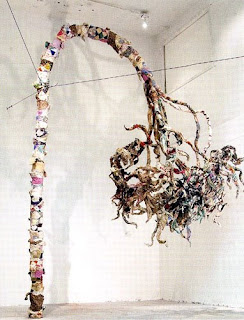 Justin Thompson, Palms Installation, 2008
With the help of some gallery hand-outs and closer examination, I saw that what Thompson had created was a soft sculpture around a metal base. The trees were made of recycled quilts! I thought it was a really great and unique idea. Walking into the main gallery, you see that Thompson has created a "forest" of sorts around the perimeter of the room. Some trees are completely upright, and some are drooping so low they touch the ground.. The quilted trees seemed to be an allegory for the past and for memory, and there was something both touching, beautiful, strong, and sad about them all at the same time.
When you walk into the next gallery, it becomes clear that these two artists have absolutely no connections nor anything in common. First of all, David Schirm's preferred medium is oil paint. Second, and more importantly, the majority of Schirm's works deal with blood, violence, and the end of the world. I was actually uncomfortable around some of his paintings that bear names like Celebration of the Bone Yard, Blood of the Waters, and End of Days.
 David Schirm, End of Days, 2008.
Many of his paintings show fountains, rivers, or oceans of blood. It was really unsettling. At the same time, there was one of his paintings that I loved, entitled Dome of the Poet. The painting shows a semicircle of blue against a dark background, and there are many light colored curlicues all over the painting. They are closer together and more prominent against the blue, and they seem like stars in a night sky. Over all, it really reminded me of Starry Night. There is a small red spot on the bottom of the painting, which reminded me of a star gazer, and someone looking out into an infinite void of stars. Unlike Schirm's other pieces, this one instilled a sense of hope in me.
Overall, I really liked the way the gallery was set up. You could walk in and out without ever seeing another person and you had plenty of privacy to view and appreciate the art in your own way.
 David Schirm, Dome of the Poet, 2008.
Sunday, September 7, 2008
Response to "The Creative Act" by Marcel Duchamp
If I'm going to be honest, I have to admit that I am not Marcel Duchamp's biggest fan. While I appreciate his innovation and desire to change what we consider art and how we view it, I still have never been particularly drawn to any of his own artistic works. That being said, I also have to admit that I was genuinely impressed by his article, "The Creative Act." There were many comments or remarks that stuck out to me, and I like the way he viewed the art surrounding him.
His main argument is that there are two factors in the creation of a work of art: the artist, who actually creates it, and the spectator, who decides if the piece is worthy of more attention and renown. I loved this quotation:
His main argument is that there are two factors in the creation of a work of art: the artist, who actually creates it, and the spectator, who decides if the piece is worthy of more attention and renown. I loved this quotation:
"Millions of artists create; only a few thousands are discussed or accepted by the spectator and many less are consecrated by posterity... the artist may shout from the rooftops that he is a genius: he will have to wait for the verdict of the spectator... [to see if] posterity includes him in the primers of Artist History."This is a true statement that has haunted me about art history for years. It seems like such a game of luck as to which artists actually become famous and which are lost to the shadows of history forever. Which artists can be guaranteed to be found in Art History 101 textbooks, and which are buried somewhere in the pages of an obscure book in an even obscurer library?
My favorite artistic time period is the Renaissance, and I can't help but wonder just how many geniuses went unnoticed due to lack of opportunity or appreciation. What about those artists who are too well-mannered to "shout from the rooftops" that they are geniuses? Van Gogh comes to mind as one who never forced his art on anyone, and died alone, miserable, and poor. Yet a few decades later, his work is in the highest demand. What changed? It seems like such a risky game to play with your life, allowing the "spectator" to literally decide your fate by proclaiming your work as "genius" or excoriating it as trash.
It is nearly impossible to perceive how a work of art will be perceived by viewers. Different patrons and different audiences may provide completely opposite reviews. The process of "esthetic osmosis" (my new favorite phrase) is unique to the individual spectator. Without the symbiotic (and possibly sometimes parasitic) relationship between the artist and his spectator, there would be no new art. For good or ill, that partnership is necessary for us to continue to designate masterpieces, and to see who will never achieve posterity and thus will be lost forever. Still, if we are to listen to Duchamp, at the end of the day "bad art is still art in the same way that a bad emotion is still an emotion."
Marcel Duchamp, "The Creative Act, " 1957.
Maria Lewis, "Art Minimal & Conception Only," 1999.
Review of the "Op Art Revisited" Exhibit at the Albright-Knox Art Gallery, Buffalo, New York
A friend and I decided to take advantage of the museum's free admission last Friday to go see the "Op Art Revisited" show at the Albright-Knox. Since it was a special exhibition, there was a nominal fee to enter, but we learned that museum members were able to see it for free. We had both been meaning to buy memberships for years, and we figured that, as seniors in college, this was a good a time as any! The exhibit itself was located on the upper level of the Gallery. Visitors must walk through the current "Natalie and Irving Forman Works on Paper" exhibit to get to the Op Art, and I thought the Minimalist works on paper were a nice foil to some of the later works we'd be seeing at Op Art.
I have always been a fan of Op Art and optical illusions in general. I would go out of my way to look for optical illusion books way before I started looking for books on Botticelli and Gentileschi! I still have a special place in my heart for Op Art, so I was excited to have a chance to see the exhibit, which absolutely did not disappoint. There was a vast range of styles, from Jean Pierre Yvaral's "Acceleration #15," which was made up of cords and painted wood, to Klaus Geissler's strange "Space Chamber," which made you feel like you were really looking into another world, to Bridget Riley's dreamy canvases that seem to swim before your eyes. The works seemed to either have been created predominately in the "age" of Op Art (the 1960s) or much more recently, such as from the year 2000 and on.
The entire exhibit was arranged in a series of five galleries, which were set up a little awkwardly to my taste. However, the lighting was excellent in all rooms but one, where there were several lighted artworks all in close proximity to each other - the lights reflected off the other pieces, and took away from the overall effect of the individual works. There was also a relatively equal balance between male and female artists - Bridget Riley even had a room dedicated to her.
I had two favorite pieces in the exhibit. The first was located in the first room, and was created by Josef Levi. His work, "Simurgh," from 1965, is the definition of an optical illusion. It's surreal to think that by simply placing two identical sheets of mesh grates several inches apart, you can create an illusion so entrancing that it can almost give the viewer a headache if he were to look at it for too long! I couldn't find a bigger picture than this, and unfortunately, you can't really get a feel for the illusion without seeing it in person.
My other favorite piece had an entire room dedicated to it. "Triple Ripple," by Olafur Eliasson, is an installation that uses three slowly spinning, vertical disks, that are suspended from the ceiling. On one side of each disk, there are concentric circles that are made from mirrors, and with the help of a single lamp in the corner, they catch the viewers' reflections as they revolve slowly. It was extremely creative and the piece created a mood that was both calm and curious. It was interesting to compare Levi's 1965 piece to Eliasson's, which was created in 2004. The desire to create Op Art is still alive, but each decade had very different interpretations of the same subject.
Subscribe to:
Posts (Atom)